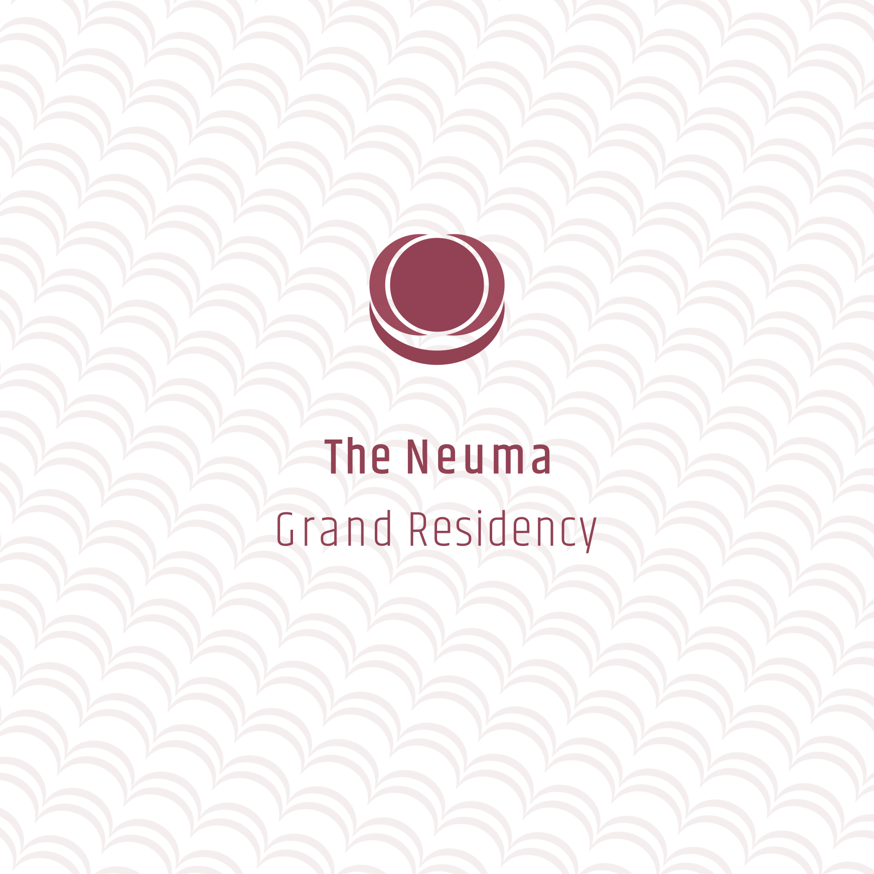
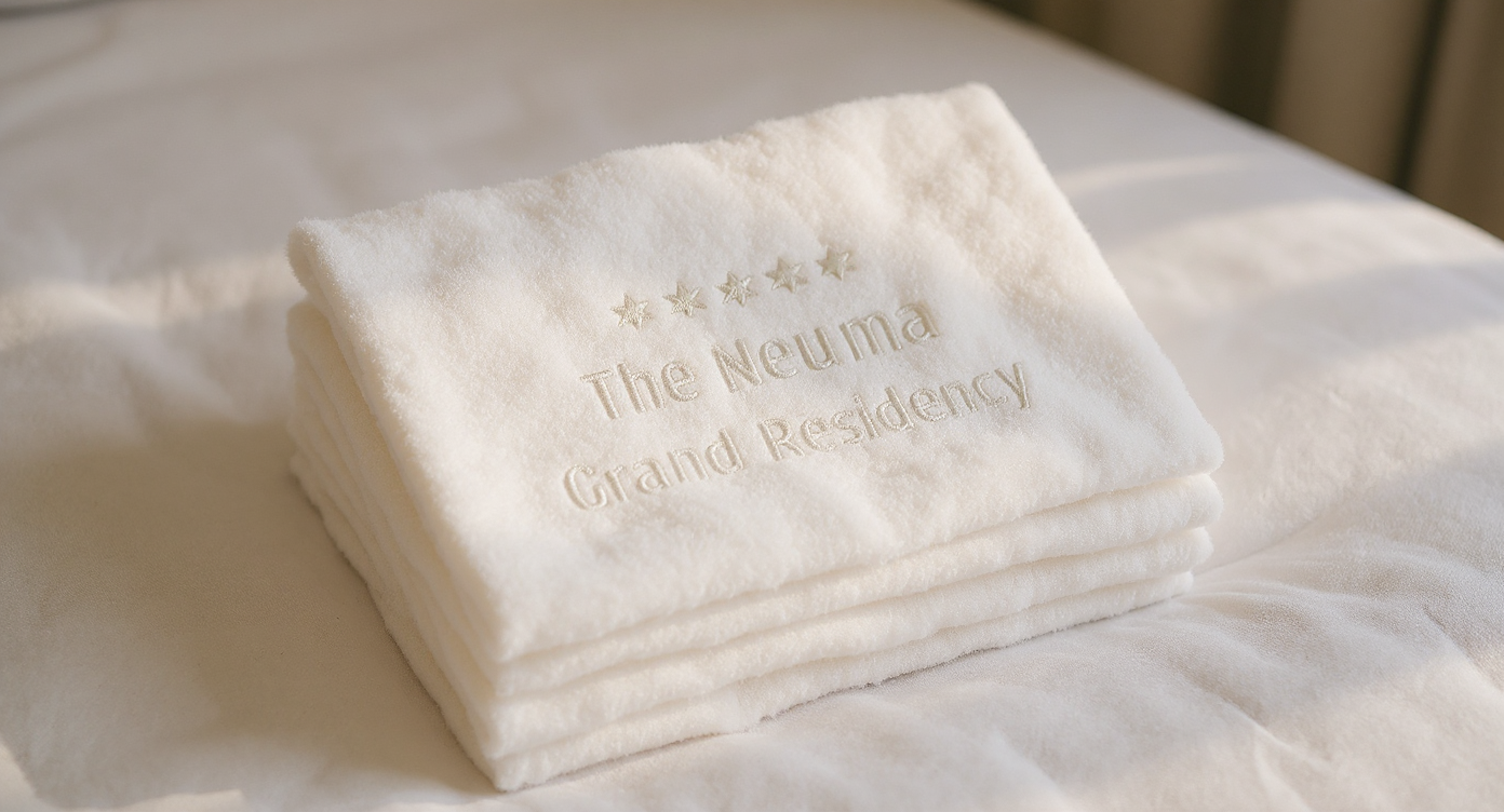
The Neuma Grand Residency

Just to be clear before you read on—The Neuma Grand Residency is a personal passion project. I didn’t build this for a real client; I created it entirely out of my own head simply because I love the challenge of luxury hotel branding. While I used real industry data and standards to keep the strategy grounded, this project is purely a space for me to practice my craft, experiment with new ideas, and do what I enjoy most. I love this stuff.
At the close of 2025, the global hotel construction pipeline reached an all-time high of 15,922 projects, with the luxury and upper upscale segments leading the charge. The United States commands the global market with 6,146 projects (720,089 rooms), representing 39% of the worldwide pipeline. This rapid growth is heavily concentrated in the South and Southwest, with Dallas, Atlanta, and Phoenix emerging as top-tier markets.


Designing The Neuma Brand Identity
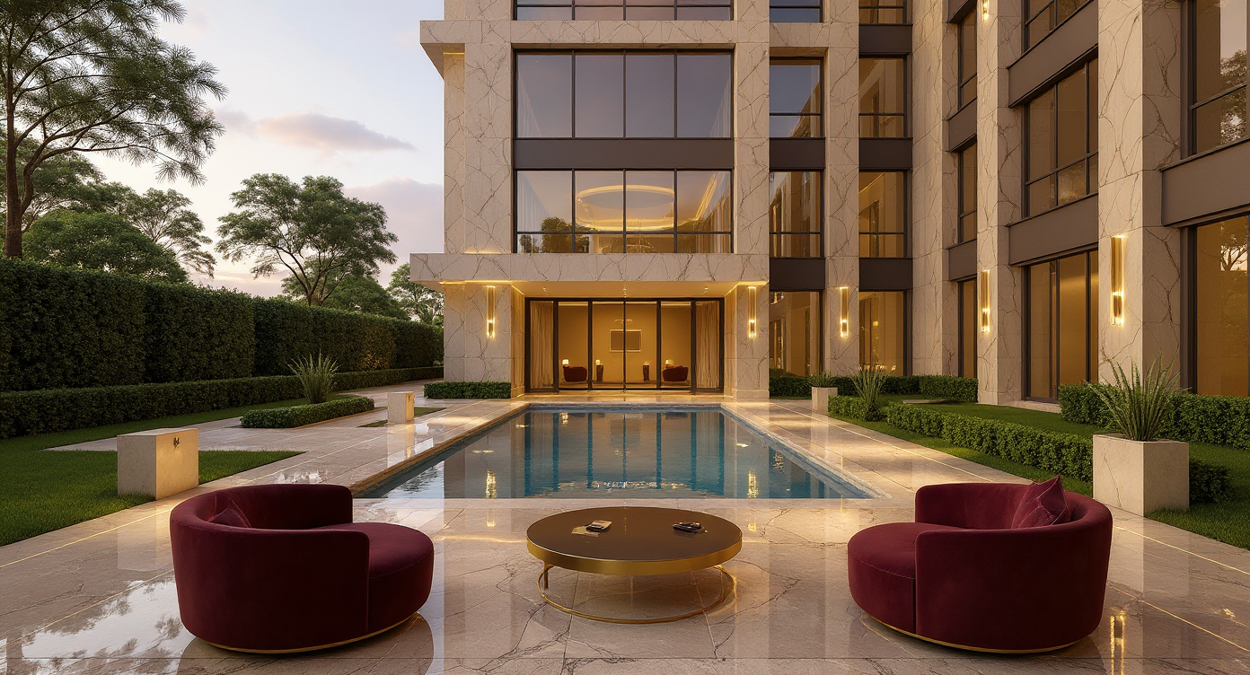
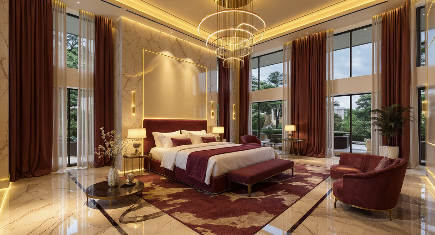
The Neuma Grand is a luxury wellness sanctuary nestled in the Arizona desert. Positioned as an elite hospitality destination for high-net-worth individuals, Neuma offers a premium, elevated experience that sets it apart from existing wellness hotels in the region.
To justify a high Average Daily Rate (ADR) and drive direct website bookings—reducing reliance on third-party travel sites—Neuma required a comprehensive brand identity system. The objective was to design a cohesive logo and visual ecosystem that ensures market differentiation and high brand recognition across all future touchpoints.
In this article I describe how I built their brand identity, from sketches to final mock ups.
Refining the Name for Premium Positioning
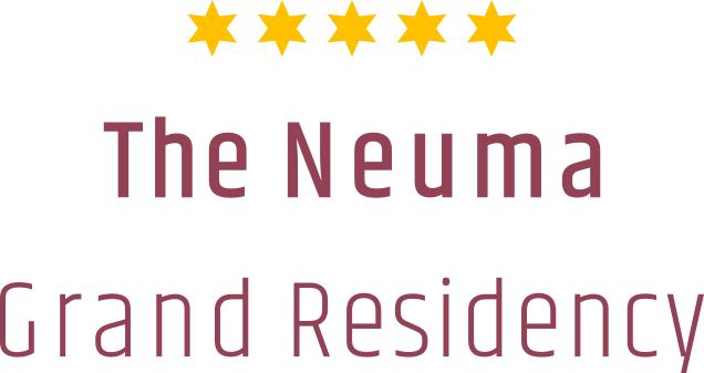
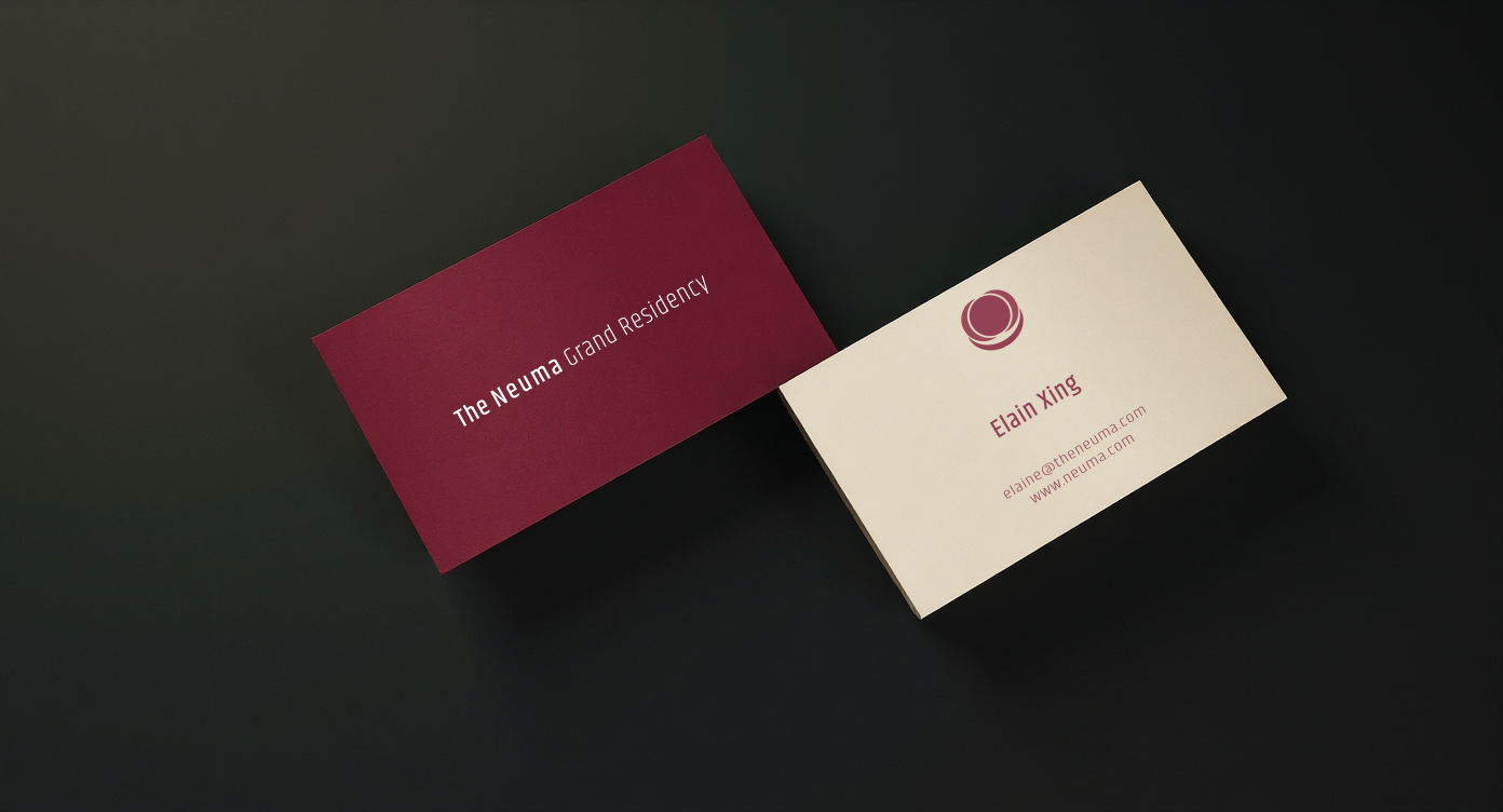
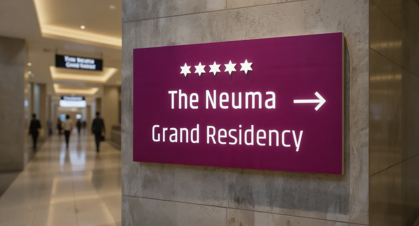
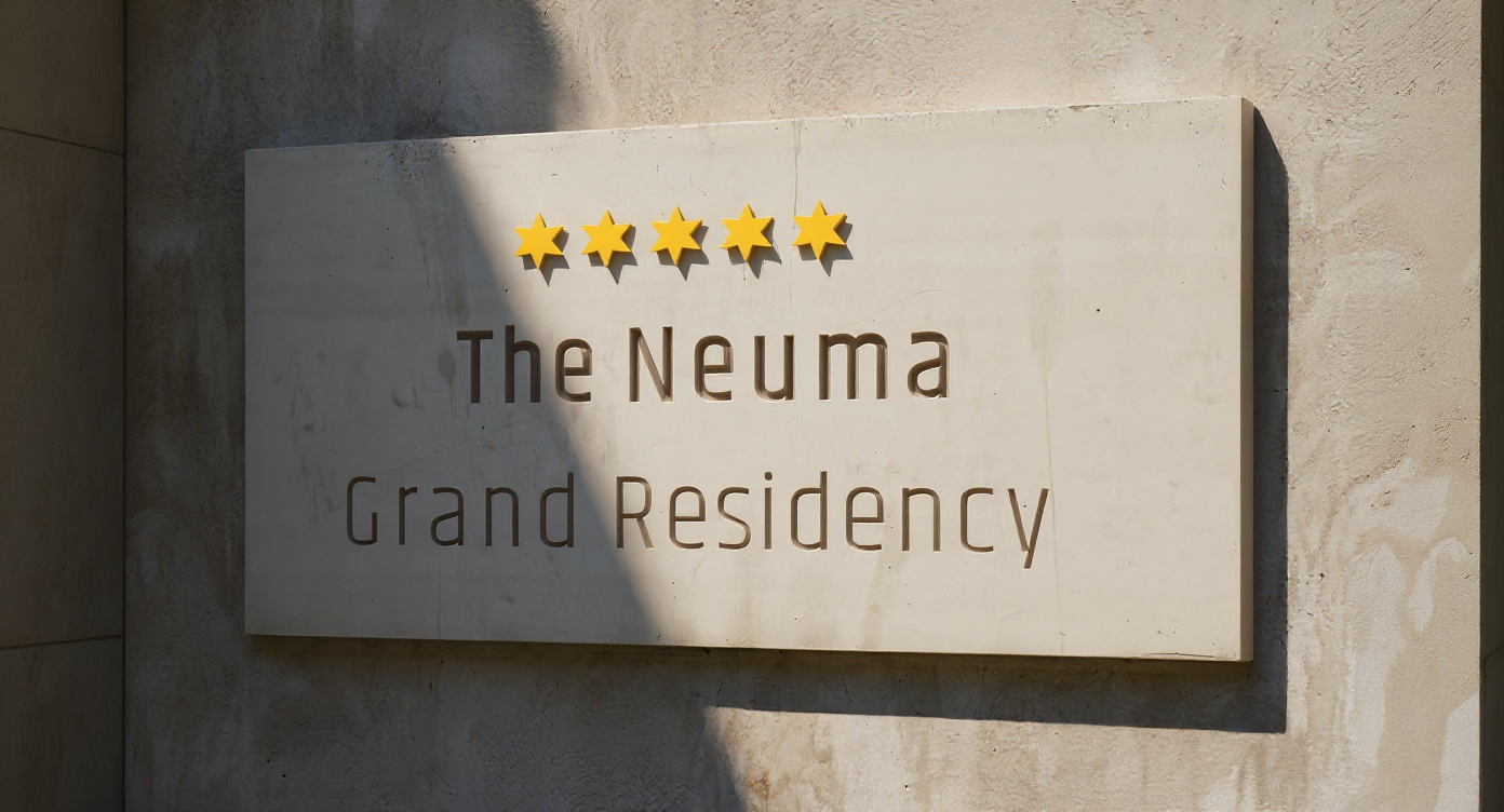
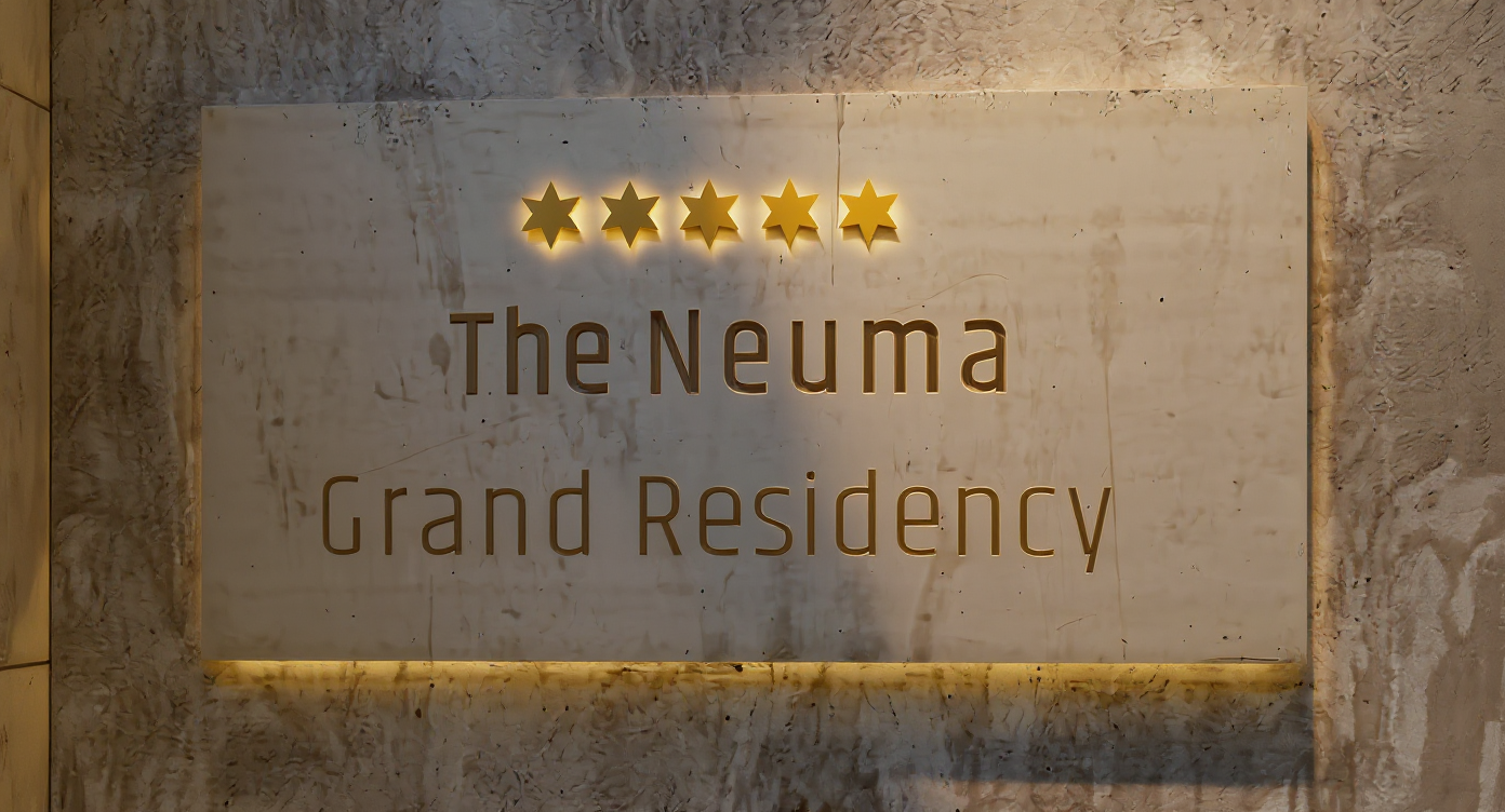
The project began with a critical strategic pivot. Originally named "The Neuma Collective," the title lacked the prestige required for a top-tier luxury market. To align with the hotel’s 5-star standard and shift consumer perception, I renamed the property The Neuma Grand Residency.
While "Collective" remains a core internal pillar of their philosophy, "Grand Residency" transforms the public perception. It evokes the feeling of an exclusive second home rather than a transient hotel stay, immediately resonating with their target demographic.
Research & Strategy
A resilient brand identity relies on deep research and strategic alignment before any design work begins. Strategy serves as the compass; without it, design is merely decoration. To establish this foundation, I conducted a series of collaborative brand workshops with the client.
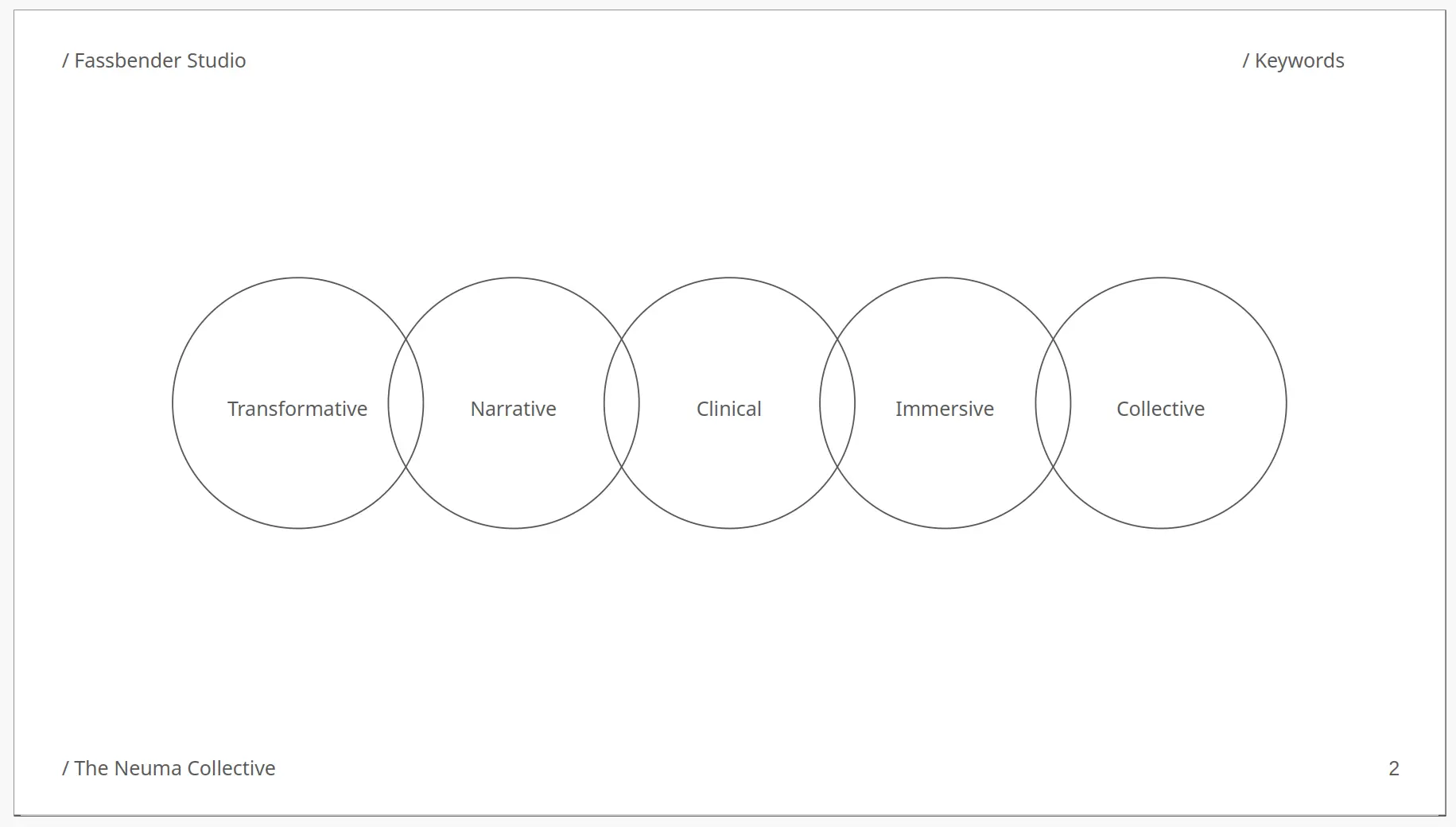
Keyword workshop (The What)
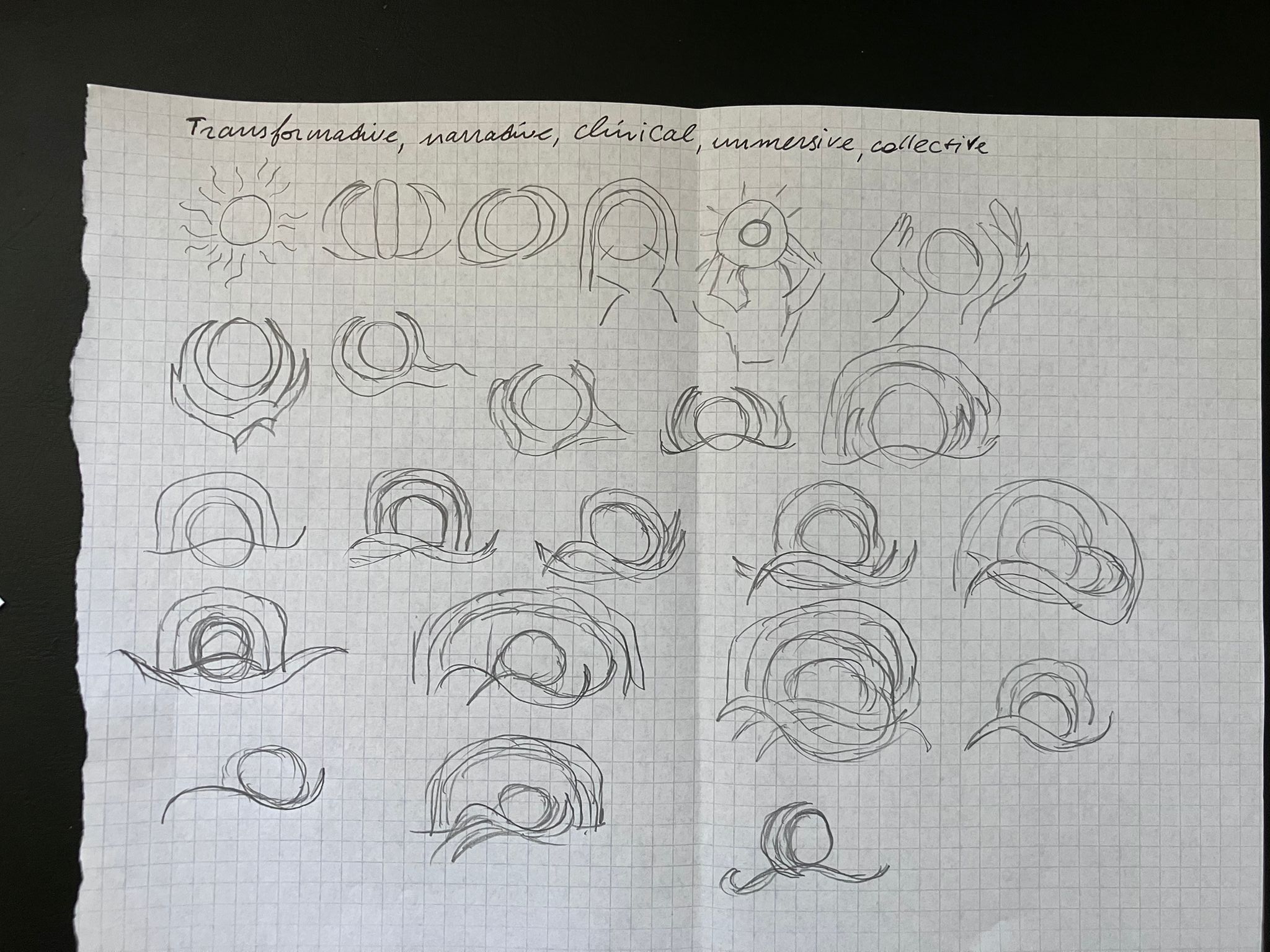
The goal was to isolate five core keywords that define the brand’s future. After auditing an extensive list, we selected: Transformative, Narrative, Clinical, Immersive, and Collective.
The Neuma Grand Residency is designed to be an immersive, effortless experience rather than a standard stay. It nourishes both mind and body through a flawless, clinical execution of luxury. Guests step into a curated narrative, leaving with a transformative story of their own.
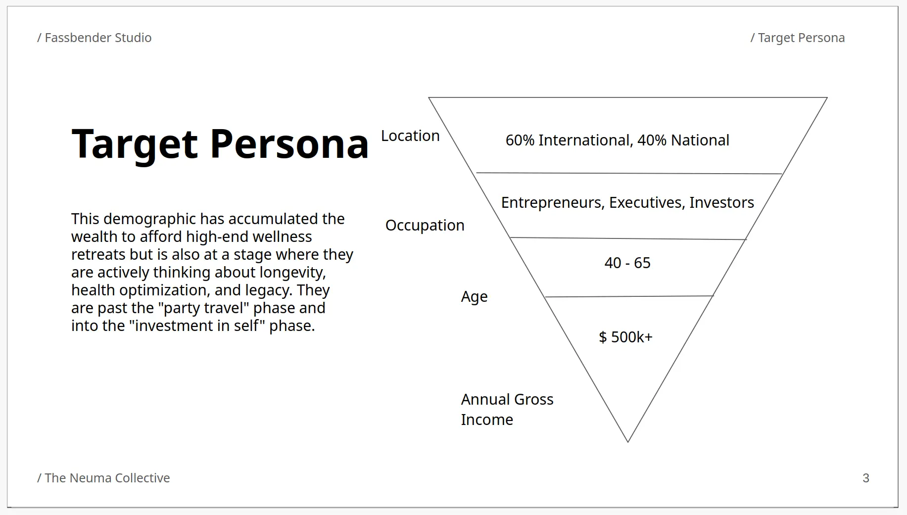
Target persona workshop (The Who)
Next, we defined our ideal customer profile: high-net-worth individuals seeking deep restoration. Identifying the exact audience ensured that every subsequent design decision was tailored to their specific aesthetic and lifestyle preferences.
Competitive research workshop
We identified Civana Wellness Resort and Sanctuary Camelback Mountain as Neuma’s primary competitors—both beautiful, established resorts with strong industry legacies. This analysis revealed three distinct opportunities for Neuma to differentiate and capture market share:
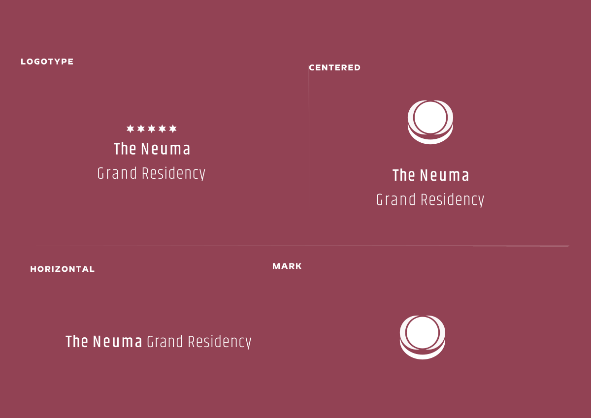
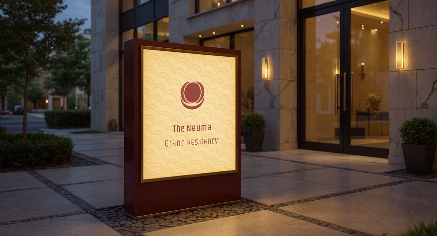
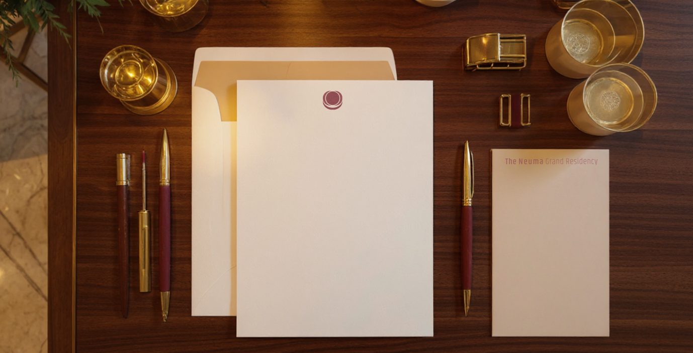
- A Standalone Mark: While competitors rely on thin, sans-serif wordmarks typical of the wellness industry, Neuma needs a strong, identifiable brandmark. The wordmark anchors horizontal layouts like websites and stationery, while the standalone mark provides high-impact vertical utility for signage and branding.
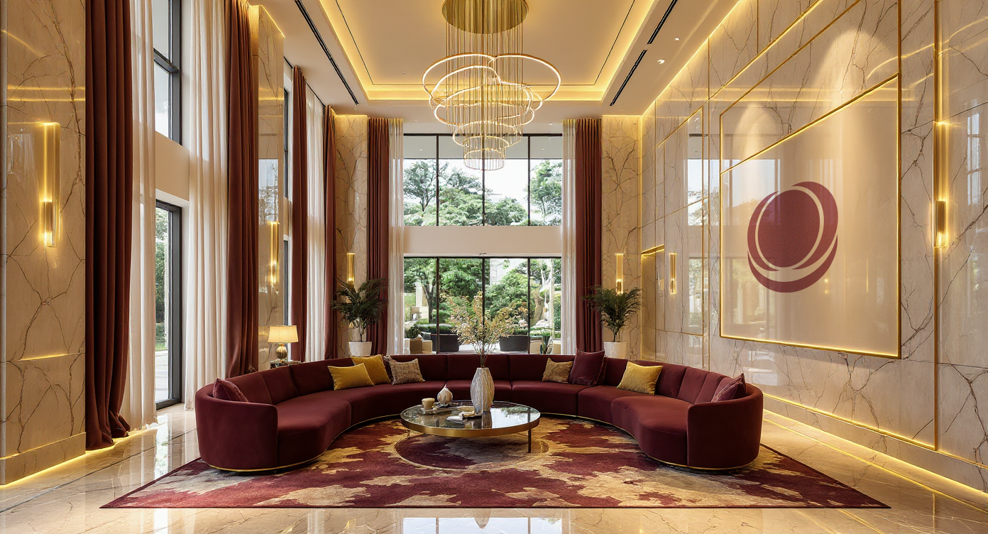
- A Distinct Palette: Most competitors rely on safe, binary black-and-white palettes. We chose to differentiate using a rich, premium color scheme that still honors the wellness ethos.
- Modern Typography: To prevent words like "Grand" and "Residency" from feeling archaic, we selected a contemporary sans-serif font to keep the visual identity modern, confident, and appealing to a sophisticated audience.
The Design Process
Conceptual Sketches
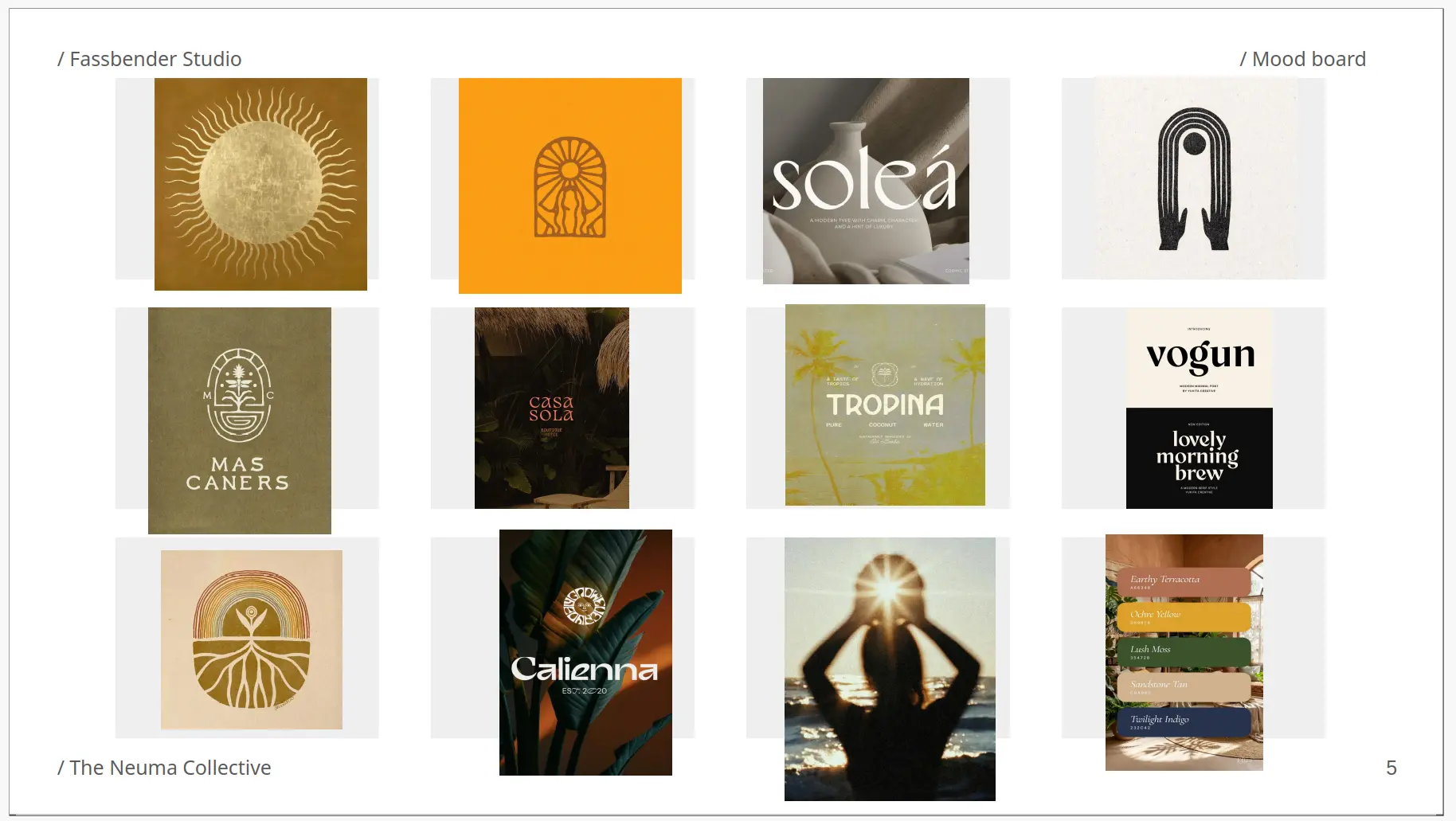
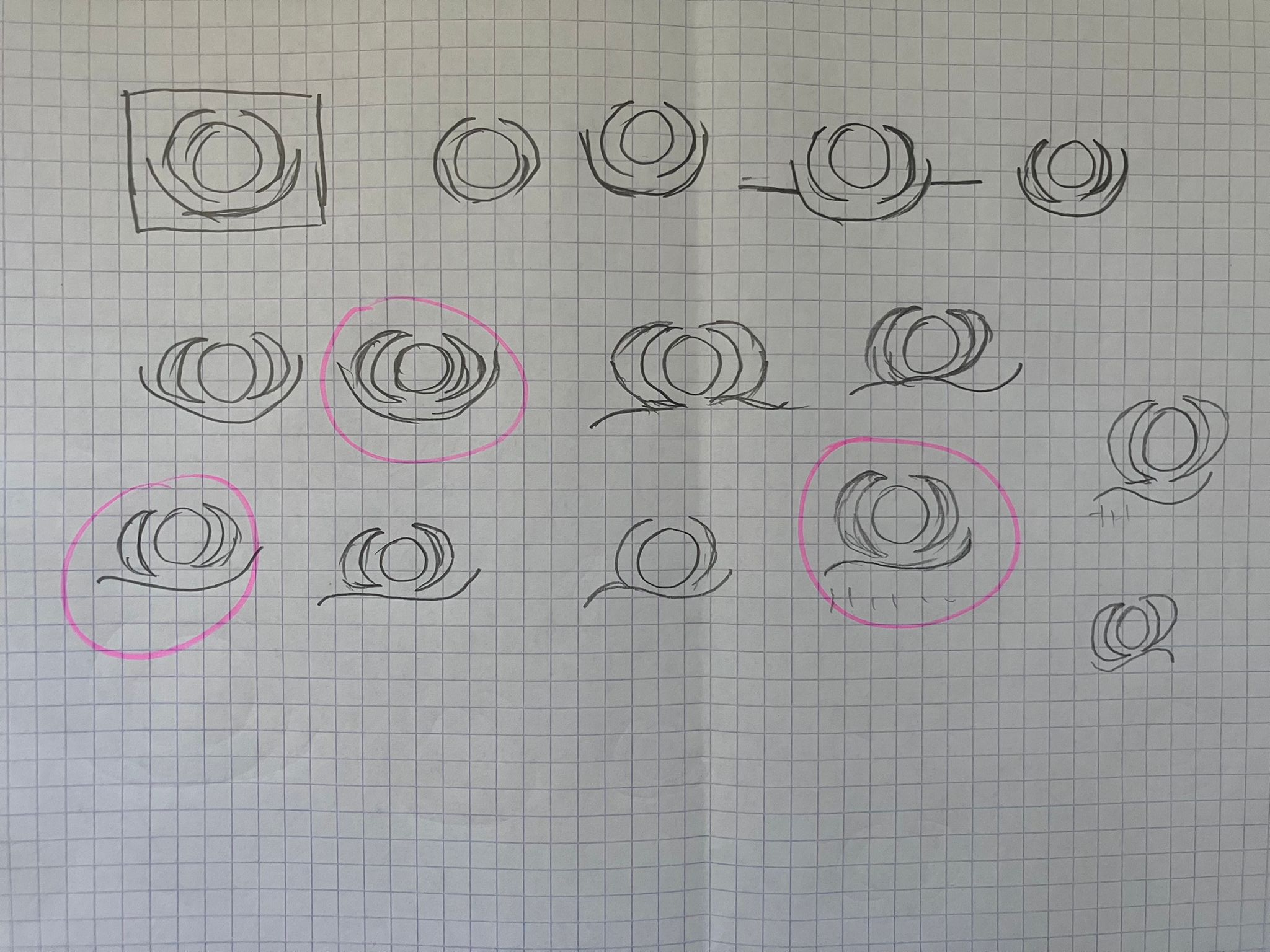
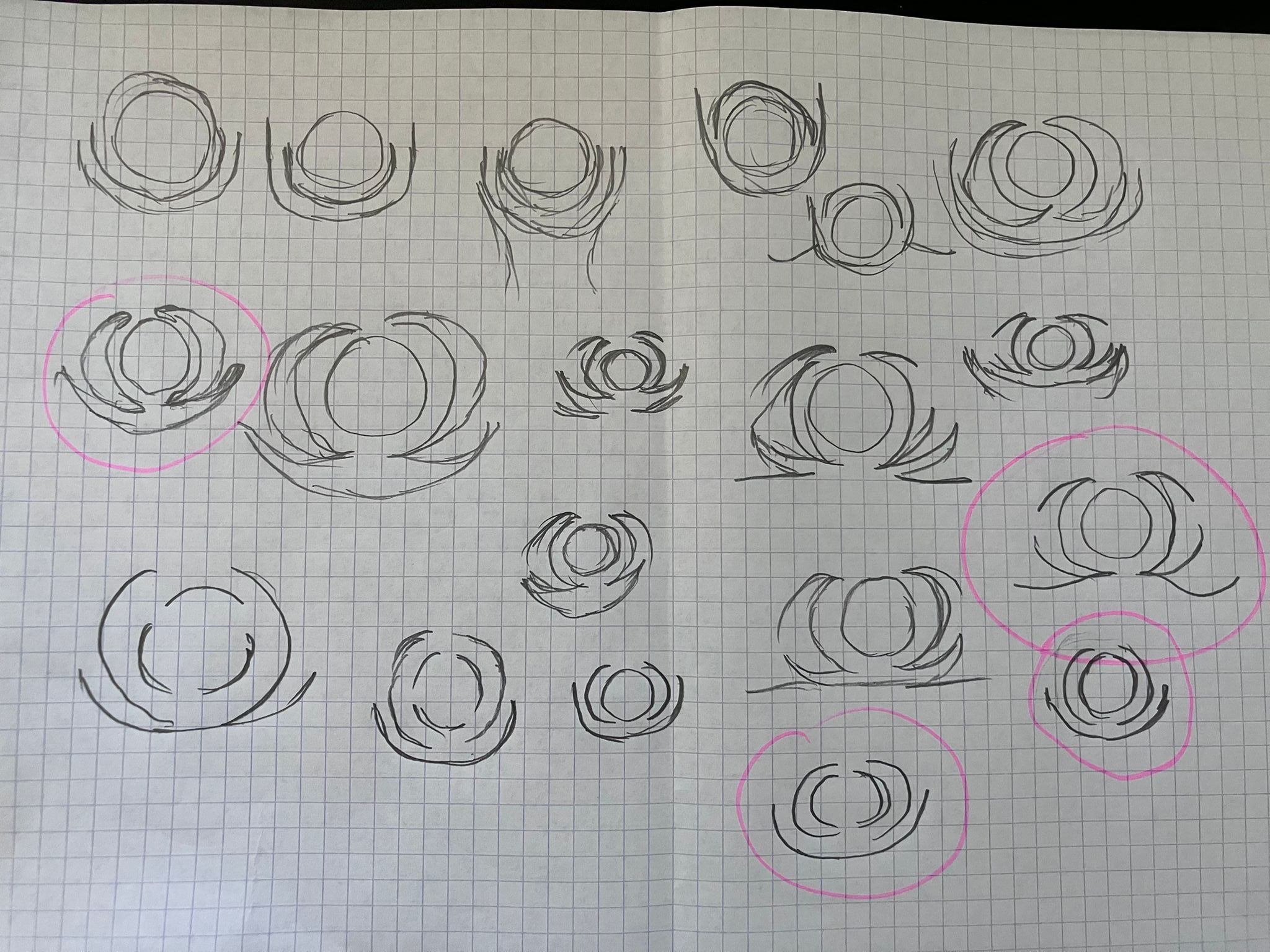
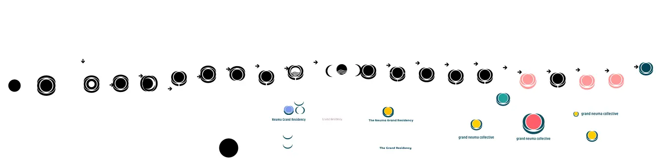
Sketching on paper remains the fastest way to explore concepts without the constraints of digital software. I generated approximately 60 sketches, focusing on two foundational geometric shapes—the circle and the quarter-circle—to visually translate our core keywords.
The Design Rationale
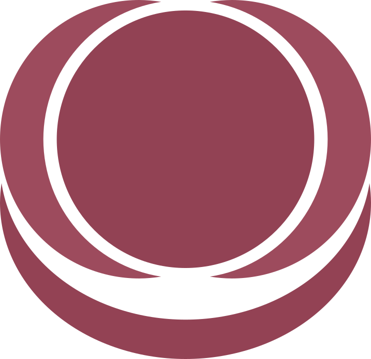
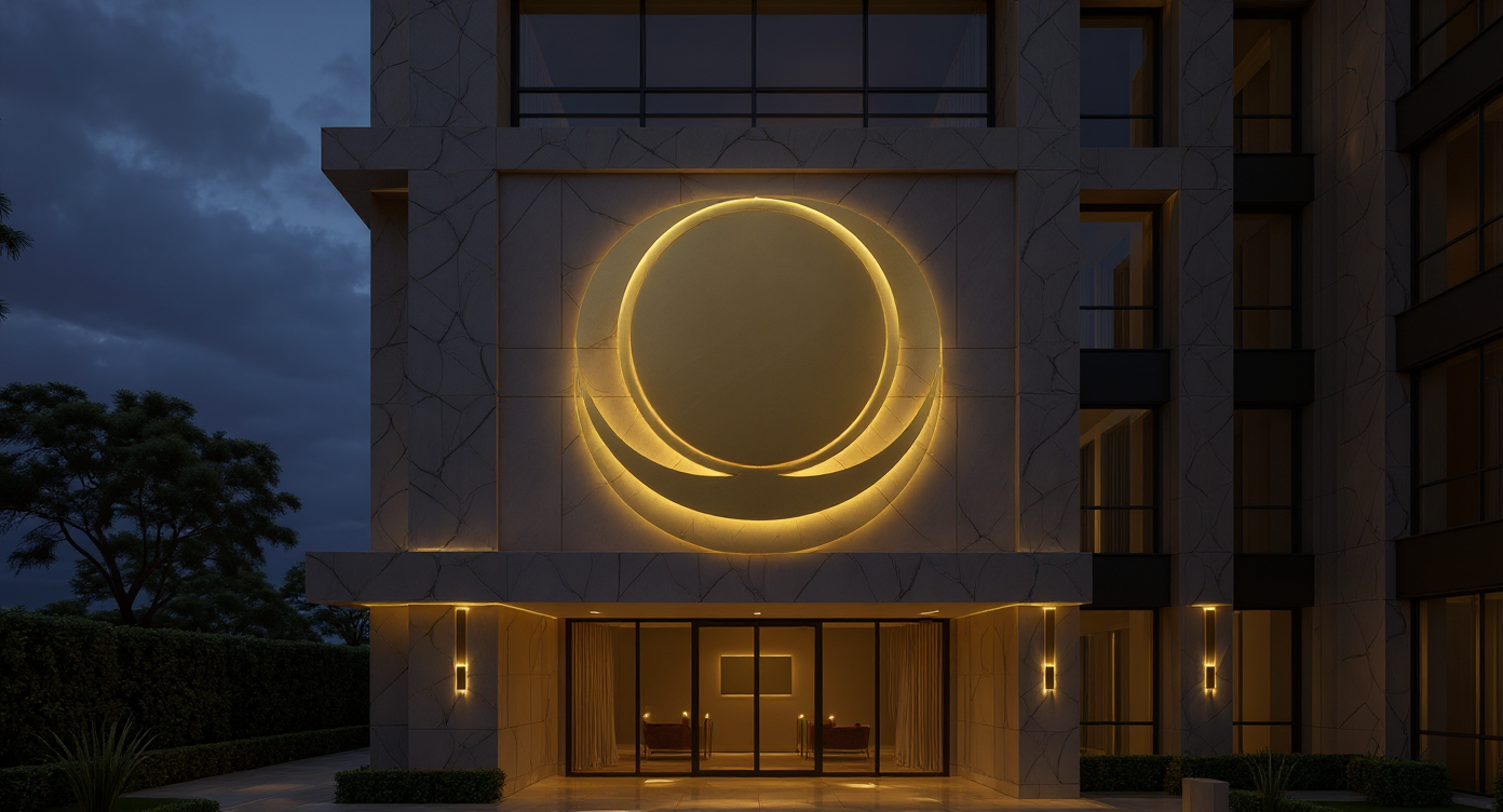
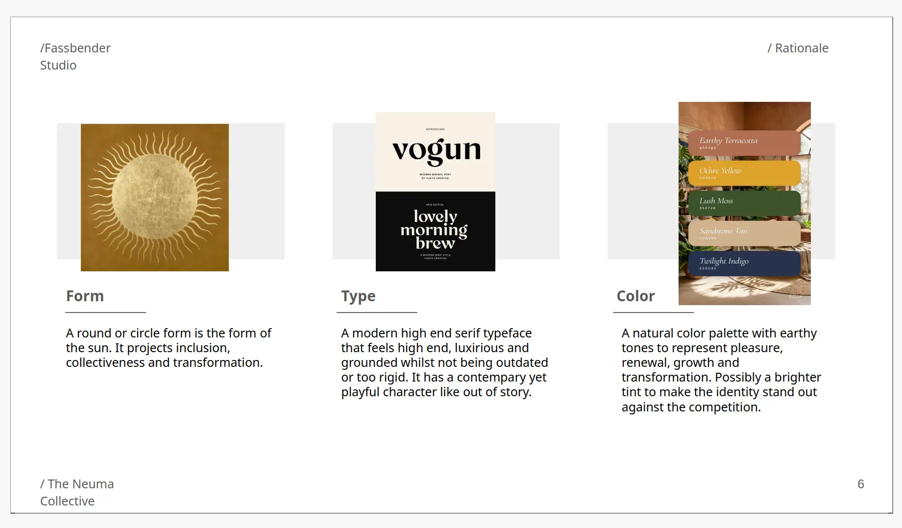
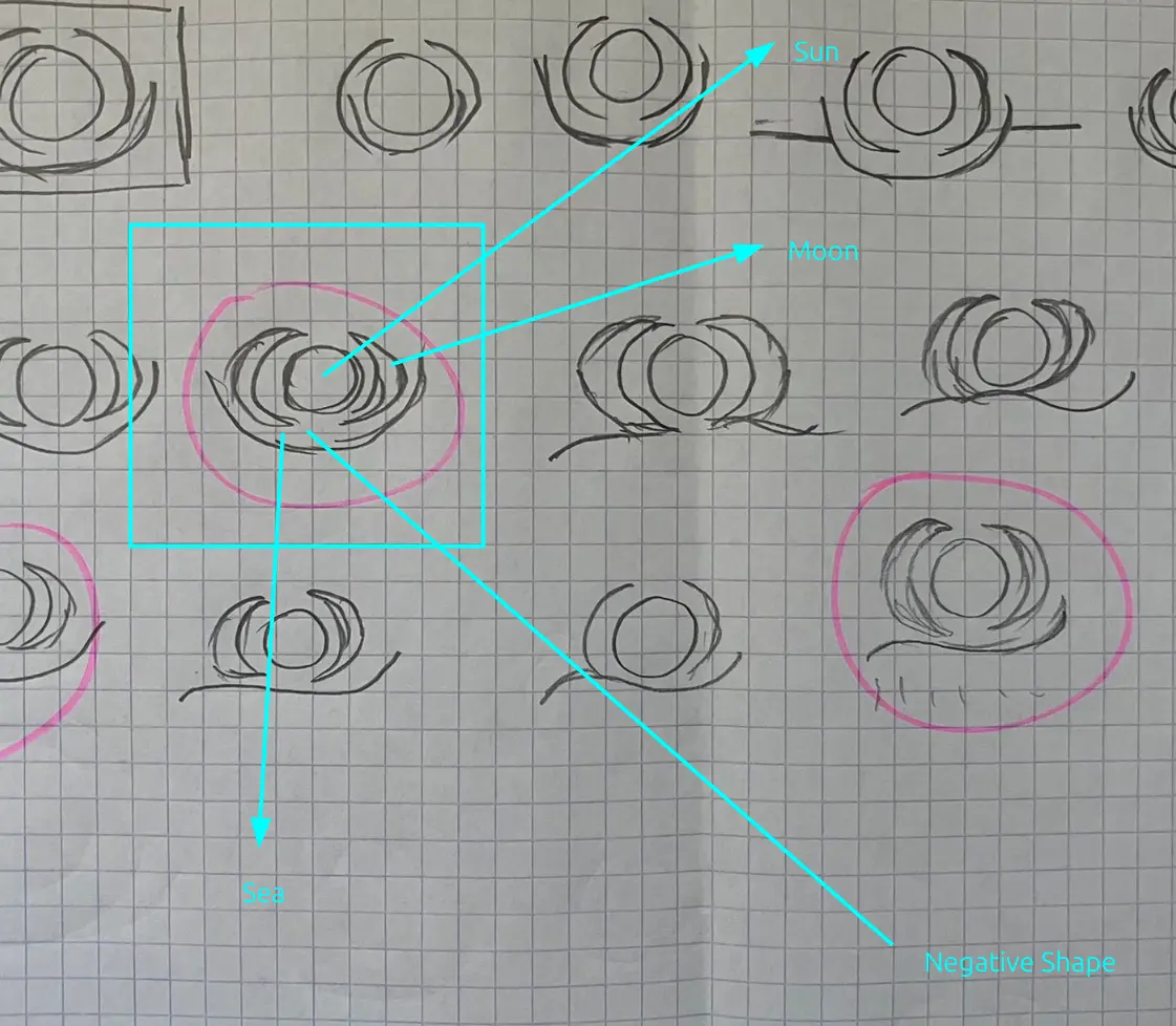
The resulting brandmark is a harmonious interplay of the sun and the moon, symbolizing transformation. The infinite cycle of day turning to night mirrors the "let it all go" experience at The Neuma. Turned horizontally, the moon shapes evoke ocean waves, serving as a metaphor for deep immersion. The central circle represents the sun, held protectively by the outer crescents to signify community and the "collective." The geometric sharpness of the overall form reflects the clinical precision and high quality of the resort.
I tried many other designs on the computer but I the moon and sun logo had the most potential.
The Hidden Visual (Negative Space)
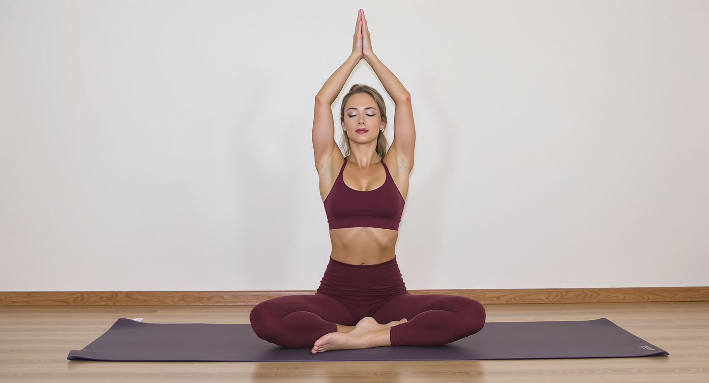
A powerful secondary detail emerges within the negative space between the moon crescents and the central sun. The white space forms the silhouette of the Parvatasana (the Seated Mountain Pose in Yoga), where the circle becomes the head and the crescents mimic hands extended upward. This posture promotes deep breathing and mental focus, aligning perfectly with the Neuma brand

Adaptability & Typography
A premium mark must scale seamlessly from a digital favicon or a luxury pen to large-scale architectural signage. The mark retains its integrity in full color, solid black, or inverted.
For the wordmark, I selected Khand as font. The strong verticality and structural, angular letterforms offer a striking contrast to the organic curves of the brandmark, resulting in a modern, confident, and sophisticated lockup.


Color & Pattern Development
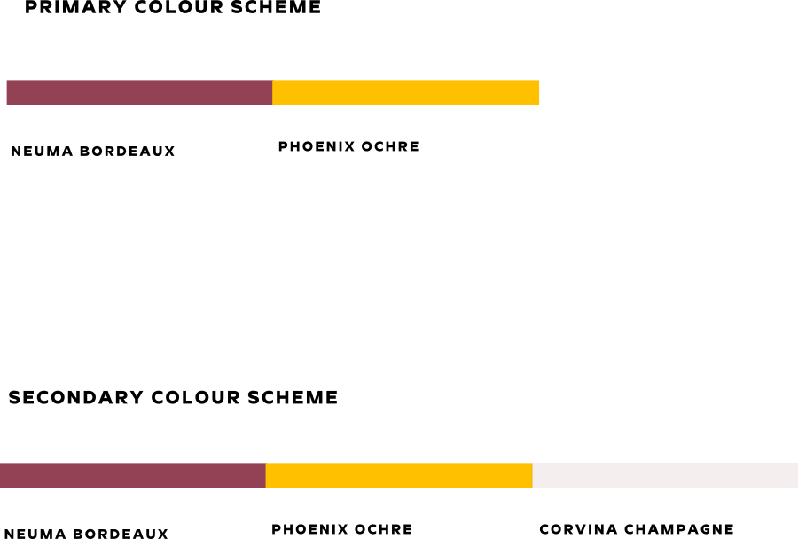
To avoid overused luxury clichés like standard black-and-gold or Tiffany blue, I developed a purposeful primary and secondary color system that ensures high contrast for accessibility while maintaining an elite aesthetic:
Neuma Bordeaux: Reduces external visual stimulation, triggering a physiological response of safety, warmth, and deep comfort.
Phoenix Ochre: Captures attention and naturally elevates cognitive alertness, warmth, and vitality.
Corvina Champagne: Reflects light to convey immaculate cleanliness and openness, inducing a clinical feeling of absolute order and zero cognitive load.
Brand Pattern
The supporting brand pattern is constructed by layering the twin crescents from the brandmark. Angled toward the northeast, the repetition creates the fluid illusion of forward-moving waves—a visual metaphor for the transformative journey guests experience each day at The Neuma Grand Residency.